Freedom has a fresh, new look.

We know that in the field of technology being able to change and grow is an essential quality. This applies not only to individuals but also to companies and, with that in mind, FCG is streamlining our logo to better align with what we represent.
Our founders concept of the ‘flag’ mark was chosen because the design makes one think of freedom, which embodies multiple meanings. Regardless of its faults, we live in a country that has ideals of freedom built into its basic foundations and strives to continually be better. The founders of FCG wanted that concept to be the core of the workings of Freedom Consulting Group. Our taglines, initially ‘Freedom to do more,’ as well as ‘Life. Liberty. Technology.’ further these ideals.
It is important to note that the ‘flag’ mark was not to be a duplicate of the American flag, because our company is deeply respectful of the American flag and what it stands for. FCG has a flag that is not red, white, and blue – not a copy of the flag we respect. However, the similarity in its composition is enough that it reminds us of the liberties our flag represents. It’s a reminder to our founders and staff of what kind of company we want to be, what kind of service we want to provide to our customers, and what kind of service we want to provide to our employees.

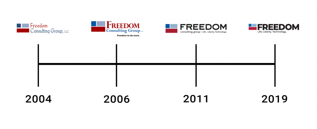
Freedom has altered the logo mark over the years, as well as the logo and tagline in general, because we’re not afraid of change. Our first logo is referred to as ‘classic ‘, while our second version was more of a serif font, and our most recent version set the basis for what we have come to today. We felt that we wanted to do something different to move us forward for our 15 year anniversary. Most people refer to us by either ‘Freedom’ or ‘FCG’ – ‘Consulting Group’ just takes longer. So, we’ve removed ‘Consulting Group’ from the logo to emphasize Freedom even more. It’s our way of affirming our identity and recognizing what our focus is, and always will be, for our employees: Freedom.